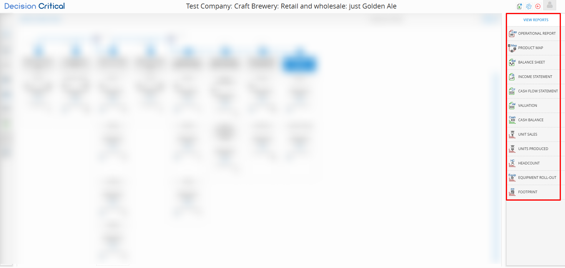
Understand Reports in a Scenario
Each scenario in Decision Critical isn't just a financial forecast—it's a full operational plan. To make sense of it, you need to know where to look. DC automatically generates a range of reports for every scenario, covering everything from revenue and cash flow to production, staffing, and inventory.
These reports help you understand how your assumptions play out across different parts of the business. Whether you're in finance, operations, or leadership, reading these reports correctly is key to making informed decisions and aligning your team around the right plan.
This section will explain reports in the scenario that including
Financial Reports:
-
Income Statement – Revenue, expenses, and profit over time
-
Balance Sheet – Assets, liabilities, and equity at any point
-
Cash Flow Statement – Where your cash comes from and goes
-
Cash Balance – Visual track of your cash position
-
Valuation – Business value based on your model
Operational Reports:
-
Operational Report – Summary of key assumptions and drivers
-
Product Map – Step-by-step view of your production flow
-
Unit Sales – Forecasted sales volume by product or category
-
Units Produced – Production volume by item or line
-
Headcount – Number of employees by department or role
-
Equipment Roll-out – Deployment timeline and costs
-
Footprint – Geographic or location-based expansion
-
Product Map, Units Produced, and Equipment Roll-out are primarily for manufacturing businesses.
-
Traded goods businesses may use Unit Sales, Footprint, and selected operational views.
-
Service businesses typically rely on Headcount, Financial Reports, and scenario modeling without production layers.
| Report | Manufacturing product | Traded Goods | Service |
|---|---|---|---|
| Cash Balance | ✅ | ✅ | ✅ |
| Valuation / DCF | ✅ | ✅ | ✅ |
| Balance Sheet | ✅ | ✅ | ✅ |
| Operational Report | ✅ | ✅ | ✅ |
| Unit Sales | ✅ | ✅ | ✅ |
| Unit Produced | ✅ | ❌ | ⚠️ Simple services only |
| Product Map | ✅ | ❌ | ❌ |
| Equipment Roll-Out | ✅ | ✅ | ✅ |
| Headcount | ✅ | ✅ | ✅ |
| Footprint | ✅ | ✅ | ✅ |
⚠️ Notes:
-
Unit Produced is available for Service products only if you're modeling a simple service that behaves like a product (e.g. sessions, units delivered).
-
Product Map is exclusive to Manufacturing, where production steps are modeled.
Before dive into reports...
-
Breakdowns: Some rows have blue clickable text. Click to explore more details—like specific production steps, resource usage, or employee allocations.
-
Full-Screen View: If the report opens in a smaller window (within the right-hand pane), click the expand button in the top-right corner of the report panel to view it in full screen
-
Valuation Report Locked: If you can’t open the Valuation report, it usually means the scenario is insolvent (i.e. out of cash), you can check it in the Cash Balance report. To fix this, review your operational assumptions or add financing to restore solvency.
-
Use the horizontal slider at the bottom of the report to move through different months or periods in your forecasting horizon.
Operational Report
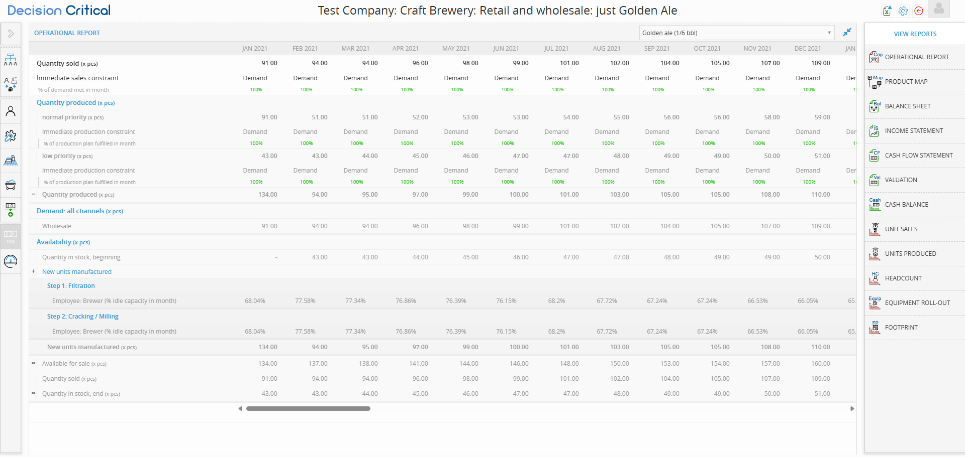
The Operational Report connects your assumptions to real business activity. It’s designed to help you understand how production, demand, and inventory behave over time. This view is useful for finance teams, operations leads, and business owners alike.
The Operational Report shows how your production, inventory, and sales flow together over time—based on the assumptions in your scenario.
This view is product-specific. You can see which product you’re analyzing in the top-right dropdown and switch between products anytime.
Use this report to understand if you’re producing enough to meet demand, managing stock efficiently, and keeping operations in sync with your plan.
Quantity Sold
Shows how many units were sold during each period.
Also displays what percentage of total demand was met (e.g. 100%).
If less than 100%, it may signal limited inventory or production shortfalls.
Quantity Produced
Displays how many units were manufactured, typically split by priority:
-
Normal priority
-
Low priority
This helps clarify how production capacity is allocated and whether key products are being prioritized.
Availability
Summarizes inventory movement within each period:
-
Starting inventory
-
New units produced
-
Units available for sale
-
Quantity sold
-
Ending inventory
Helpful for identifying overproduction, underproduction, or stockouts.
Demand (All Channels)
Shows total demand across all customer segments (e.g. wholesale, retail).
Use this to ensure production and inventory levels are aligned with what the market needs.
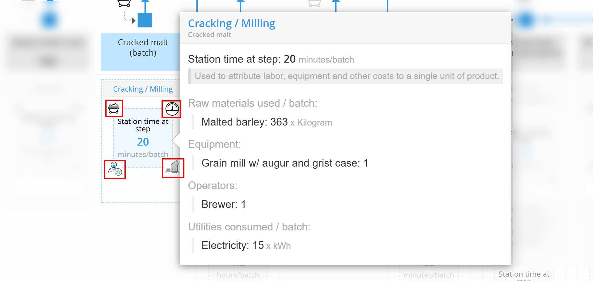
Product Map Report (For service and manufacturing)
The Product Map visualizes the step-by-step manufacturing process for a specific product. It’s based on the operational logic defined in your scenario—connecting inputs, labor, time, and equipment into a clear production flow.
This report is product-specific. You can see which product you're viewing in the top-right dropdown and switch products as needed.
Use this report to understand how your product is made, what resources it requires, and how each process step contributes to time and cost.
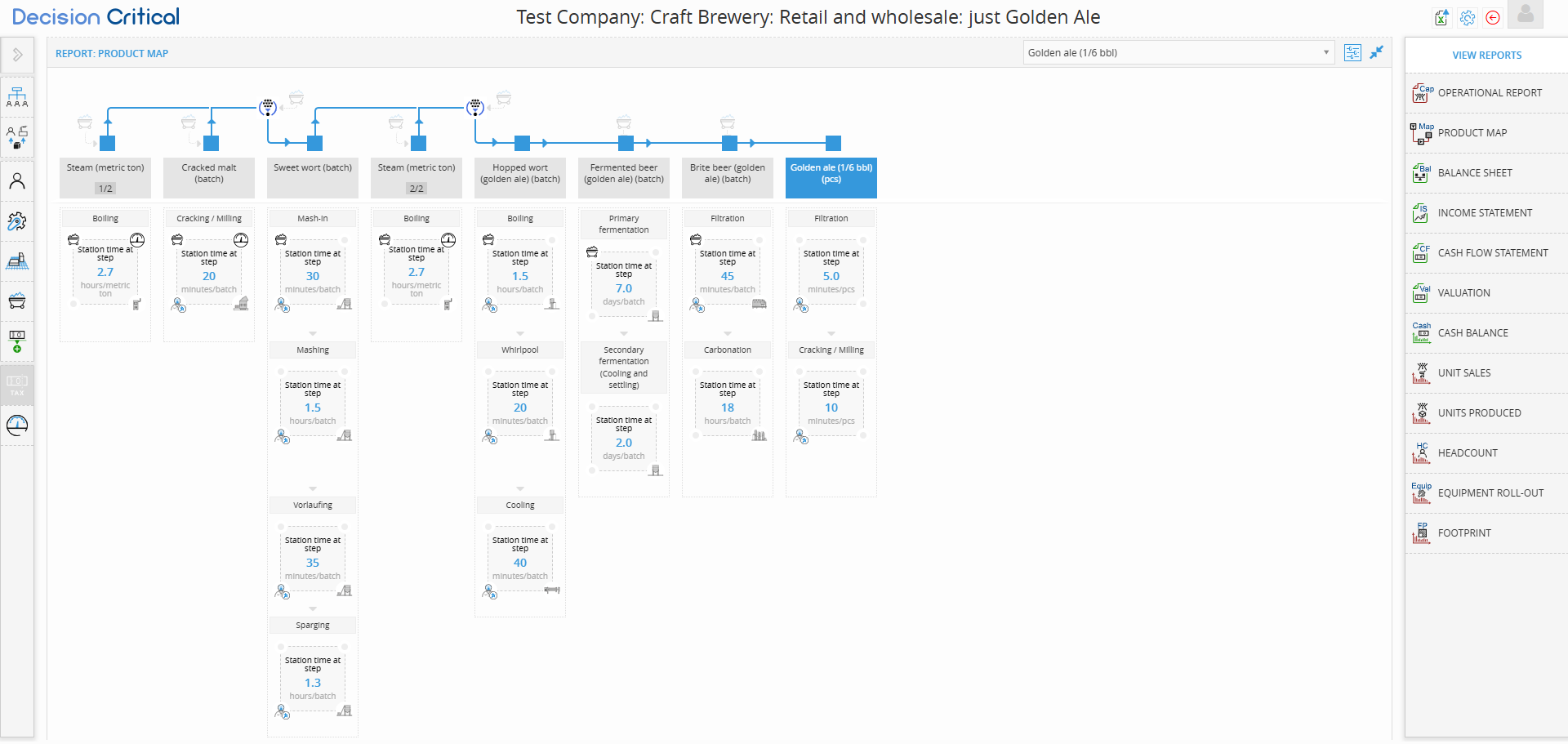
Process Flow
Displays the full production chain from raw materials to finished goods.
Shows each station, its sequence, and how materials flow from one step to the next.
Useful for identifying process length, dependencies, and potential bottlenecks.
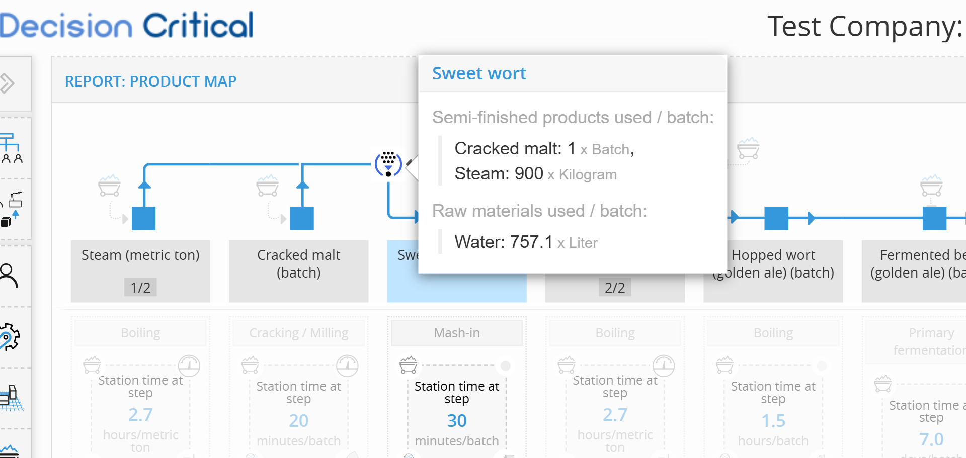
Step Details (Hover Function)
When you hover on a step, you’ll see detailed information, for instance:
-
Time spent at the station
-
Raw materials and semi-finished inputs
-
Labor and equipment assigned
Helps you break down what each process step consumes and contributes.

Corner Icons (Step Box Layout)
Each process box includes icons that reveal what is involved at that step:
-
Top-left: Inputs (preceding steps or materials)
-
Top-right: Utilities required (e.g. steam, power)
-
Bottom-left: Staff or labor roles
-
Bottom-right: Equipment used
These visuals make it easy to understand resource requirements at a glance.
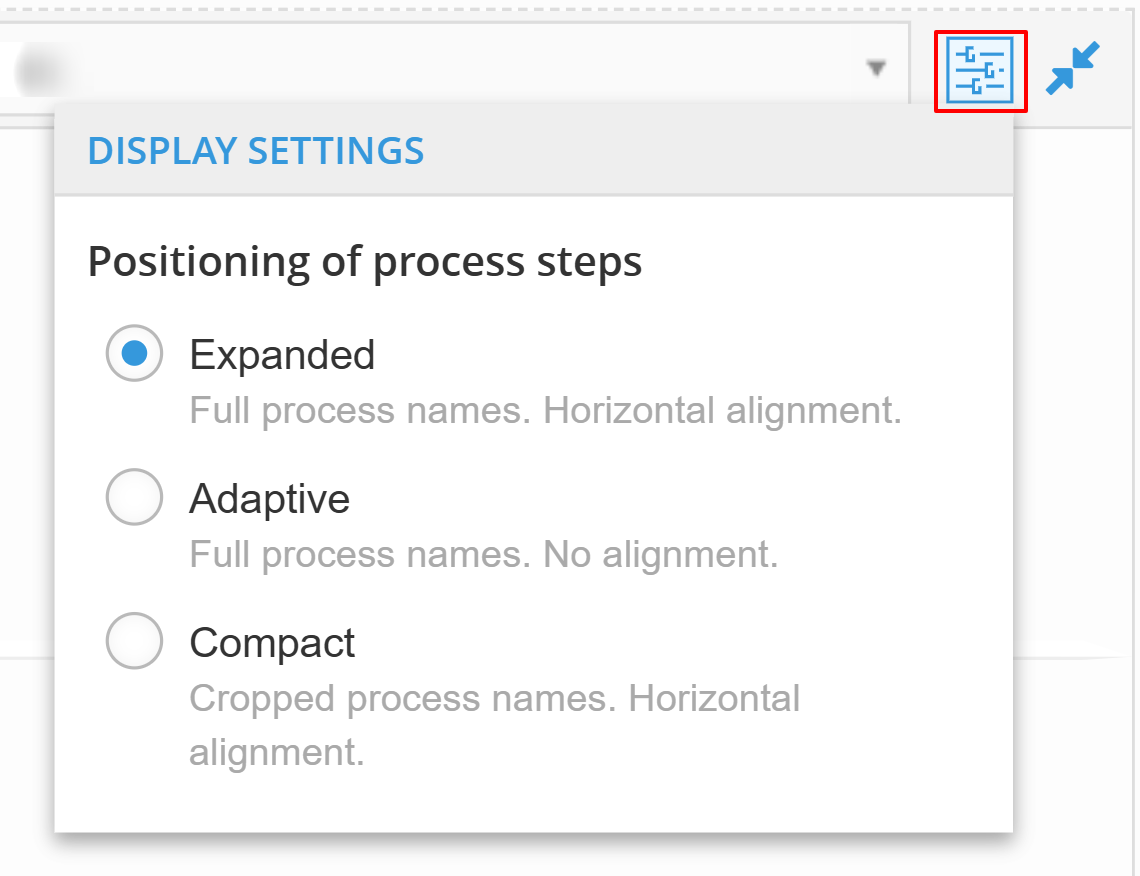
Display Settings
Customize the layout using the gear icon in the top-right:
-
Expanded – Full step names with aligned layout
-
Adaptive – Full names with flexible layout
-
Compact – Cropped names for tighter visual spacing
Use this to adjust visibility depending on the complexity of your product map.
Balance Sheet Report
The Balance Sheet shows a full snapshot of your business's financial position—what it owns, what it owes, and what it’s worth.
It updates monthly so you can track how your finances change over time.
What does this report show?
A Balance Sheet is built on a simple rule:
📘 Assets = Liabilities + Shareholders’ Equity
This means:
-
Assets = what the business owns
-
Liabilities = what the business owes
-
Equity = what’s left for the owners after debts are paid
Why it matters
Use this report to:
-
Understand how strong your business is financially
-
Track your debt and cash over time
-
Spot problems like rising payables or shrinking equity
-
Support fundraising, audits, and board reviews
-
Stay grounded when doing strategic planning
How to explore this report
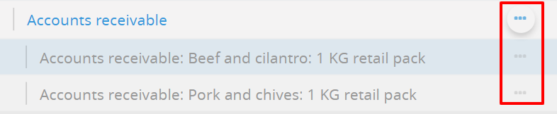
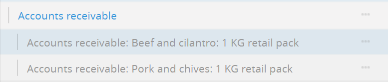
🔵 Blue rows
You can click any row in blue to expand and see more detail.
For example:
Click Inventory to see raw materials like flour or salt
Click Accounts receivable to see customer payments by product
1. Assets – What you own
Assets are everything your business owns that has value. They're split into:
🔹 Current Assets
These are short-term resources—things you expect to turn into cash within a year.
-
Cash in bank: Your available money.
-
Accounts receivable: Money customers owe you.
-
Click to see which products haven’t been paid for yet.
-
-
Inventory: Products you have on hand.
-
Click to see detailed items (e.g., Retail bag, Flour, Salt).
-
Use this section to track liquidity—how easily your business can meet short-term needs.
🔹 Long-Term Assets
Things your business uses over time, like equipment or property.
-
Equipment, at cost: How much it cost when you bought it.
-
Accumulated depreciation: Value that’s been used up over time.
-
Net equipment value: What the equipment is worth today (book value).
This helps you keep an eye on assets that drive your operations.
2. Liabilities – What you owe
Liabilities show every debt or obligation your business has.
🔹 Current Liabilities
These are payments and obligations due within the next 12 months.
-
Capitalized interest: Unpaid interest added to loans.
-
Long-term debt (current portion): Part of long-term loans due this year.
-
Accounts payable: What you owe suppliers.
-
Taxes payable: What you owe in taxes but haven’t paid yet.
-
Salary payable: Wages you owe your staff.
If this number keeps rising while cash stays flat, it’s a sign to look closer.
🔹 Non-Current Liabilities
Debts that aren’t due yet—due in more than 12 months.
-
Long-term debt (non-current portion): The remaining balance on your loans.
-
Drill down to see sources (e.g. Bank debt)
-
Tracking this helps you manage financing and plan ahead for repayments.
3. Shareholders’ Equity – What the business is worth
This shows how much of the company’s value belongs to the owners or investors.
-
Current earnings: Net income from this year (from the P&L).
-
Retained earnings: All profit from previous years that hasn’t been paid out.
Equity is what’s left after all debts are paid.
If equity is growing, it usually means your business is performing well.
✅ Verifications (Bottom of report)
At the bottom, you’ll see built-in checks:
-
Assets - Liabilities - Equity = 0 → This confirms your books are balanced.
-
Net income changes → Matches your P&L results.
-
Cash changes → Should align with the Cash Flow report.
If these don’t match, it’s a sign to double-check your inputs or assumptions.
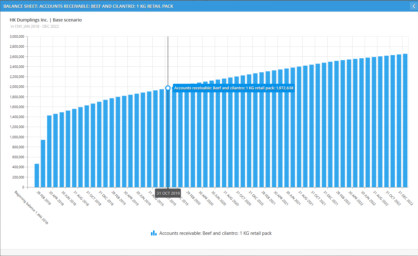
📊 Charts: Click the three dots to view trends
Any row with a ⋯ icon means it has a graph you can open.
These charts help you see how each account changes over time—month by month.
Two types of charts, depending on where you click:
1. Click on a main account
→ You’ll see a combined graph of all the sub-accounts under it.
This gives you a full picture.
Example:
If you click the chart for Accounts receivable, you’ll see a stacked bar chart showing:
Beef and cilantro: 1 KG retail pack
Pork and chives: 1 KG retail pack
Each with its own color✔ Use this to compare performance between products or accounts.
2. Click on a specific sub-account
Ex. Account receivable > Beef and cilantro
→ You’ll see a detailed graph just for that item.
Example:
Clicking on Beef and cilantro shows a clean single-line chart of that product’s receivables. Perfect for tracking specific trends over time.


Income Statement Report
The Income Statement Report shows your profitability month by month.
It starts from your total sales and walks all the way down to net income — helping you see where your profit is gained or lost.
What it shows
The report follows a standard financial structure:
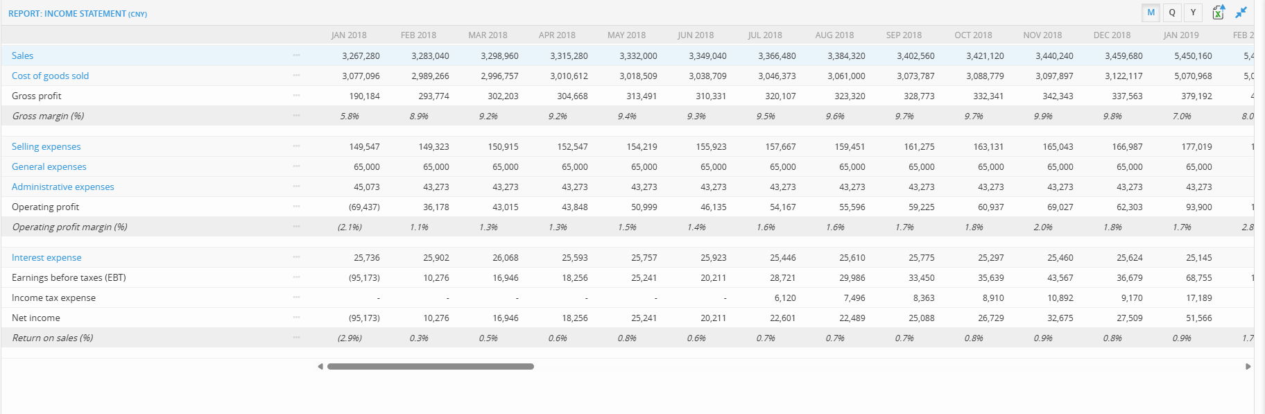
Revenue & Gross Profit
-
Sales – Total revenue from selling products or services
-
Cost of Goods Sold (COGS) – Direct costs like materials, suppliers, or production
-
Gross Profit – Sales minus COGS
-
Gross Margin (%) – Profitability before operating expenses
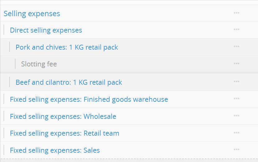
Operating Expenses
-
Selling Expenses – Costs related to sales, marketing, distribution
-
General Expenses – Regular business costs (e.g. rent, salaries)
-
Administrative Expenses – Office, HR, finance
-
Operating Profit – Profit before interest and taxes
-
Operating Profit Margin (%) – Operating profit as a percentage of sales
Profit Before and After Tax
-
Interest Expense – Cost of debt
-
Earnings Before Tax (EBT) – Profit before taxes
-
Income Tax Expense – Projected tax payments
-
Net Income – Final profit after all costs and taxes
-
Return on Sales (%) – Net income as a % of sales
🔵 Drill-down: Click blue text to explore more
Any blue text in the report is clickable.
You can:
-
Click Sales to drill into revenue by product
-
Click COGS to break it down by raw material or cost category
-
Click Selling or Admin Expenses to explore specific expense lines
Drill-downs let you zoom into what's driving each part of your profitability.
Charts: Click the three dots to view trends
Any row with a ⋯ icon means you can open a chart to visualize how that account changes over time.
These charts help you:
Track trends month by month
Compare sub-accounts
Spot seasonal spikes or unexpected jumps
There are two types of charts, depending on what you click:
1. Click on a main account
You’ll see a combined chart that includes all sub-accounts under it.
Example:
Clicking the chart for Selling expenses gives you a stacked chart of:
Pork and chives: 1 KG retail pack
Beef and cilantro: 1 KG retail pack
Finished goods warehouse
Retail team, Wholesale, and more
Each has its own color.
✔ Use this to compare product-level selling costs or team-based expense breakdowns.2. Click on a specific sub-account
Clicking on a single item drills down into just that account’s trend.
Example:
Clicking on Pork and chives: 1 KG retail pack shows a clean line or bar chart for that product’s selling cost over time.✔ Perfect for reviewing one product or team in detail without distraction.
✅ Use this report to:
-
Track overall profitability
-
Understand your cost structure
-
Compare margins month over month
-
Visualize trends in sales, costs, and profit
-
Drill into any area causing a dip in performance
Cash Flow Statement Report
The Cash Flow Statement Report tracks how cash enters and exits your business over time.
Unlike the income statement (which focuses on profitability), this report shows real liquidity — when cash is actually received or spent.
It explains why your cash position goes up or down, month by month.
What it shows
This report is split into three core sections:
1. Cash Flow from Operations
Cash generated or used by core business activity.
It starts from net income and adjusts for non-cash items and changes in working capital.
Includes:
-
Depreciation
-
Changes in receivables, inventory, payables
-
Tax and payroll movements
This section answers:
“Is the business generating enough cash to run itself?”
2. Cash Flow from Investing
Cash used for purchasing or selling long-term assets.
Includes:
-
Equipment purchases
-
Other capital investments
Often negative, but reflects business growth.
3. Cash Flow from Financing
Cash raised from or paid back to funders.
Includes:
-
Loan proceeds or repayments
-
Equity injections (if modeled)
Shows how external capital is being used to support operations or investments.
4. Total Cash Flow
At the bottom, you’ll see Total cash flow from all sources, which connects directly to the Cash Balance Report.
This is the number that actually adjusts your cash on hand.
📊 Charts: Click the three dots to view trends
The ⋯ icon on the right of any row opens a chart.
These charts help you understand how each cash item behaves over time.
How it works:
-
Click the ⋯ icon to open a line or bar chart
-
You’ll see the movement of that account month by month
-
It helps you visualize seasonality, spikes, or structural changes
✔ Example use cases:
-
Accounts receivable: See when slow customer payments reduce available cash
-
Purchase equipment: Track investment periods and how they affect liquidity
-
Cash from operations: Quickly spot if core operations are consistently generating or burning cash
Valuation Report
The Valuation Report helps you assess the potential value of a scenario based on its 5-year forecast.
It summarizes sales, profit, cash flow, and minimum cash balance, and then uses your cost of equity to run a discounted cash flow (DCF) valuation.
✅ To unlock the report, your scenario must be solvent
You must keep your cash balance ≥ 0 for all 60 months.
If it drops below zero, the valuation report will disabled.

Fix it by:
-
Adding funding (loans, equity)
-
Adjusting your cost or growth assumptions
-
Delaying big investments
Once your scenario stays solvent, the report becomes available.
Step 1: Set your Cost of Equity (COE)
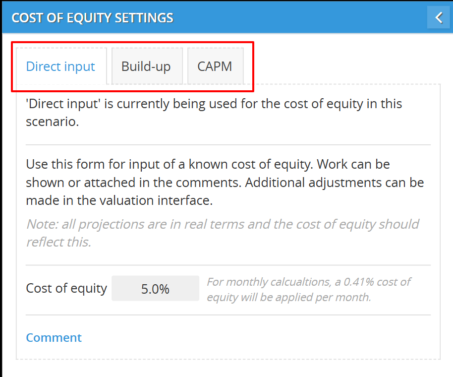
Before you can generate a valuation, you must choose how to calculate the Cost of Equity. This number represents the return required by investors and is used to discount future cash flows.
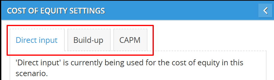
You can do this in three ways:
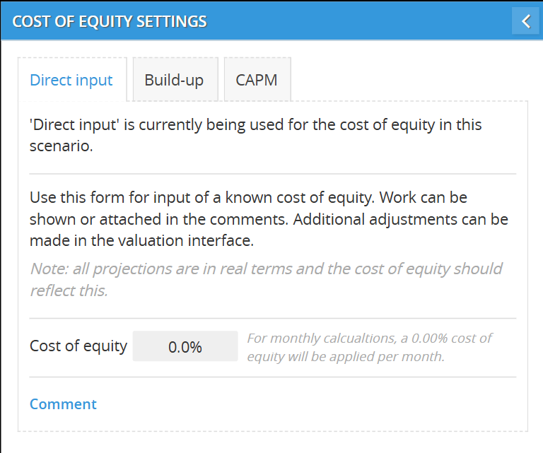
🅰️ Direct Input
Enter the COE manually.
Use this if you already have a target return (e.g. 10%).
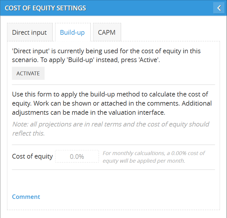
🅱️ Build-Up Method
Click Activate to switch. You can now build your COE from multiple layers.
➕ How it works:
-
Add each layer (e.g., “Risk-free rate”, “Industry premium”)
-
Enter a % and a short explanation
-
The system will total them to give you the final COE
💬 Add a comment (optional) to document your logic or attach sources.
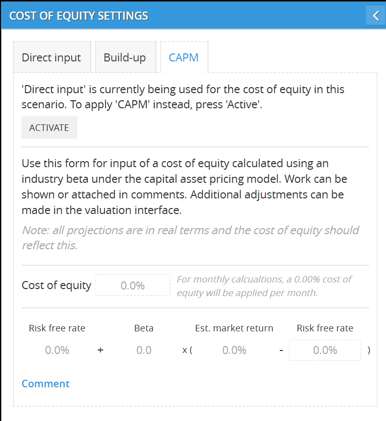
🆎 CAPM (Capital Asset Pricing Model)
Click Activate to switch to CAPM.
Enter:
-
Risk-free rate (e.g. 3%)
-
Beta (e.g. 1.2)
-
Market return (e.g. 10%)
Formula: COE = Risk-free + Beta × (Market return – Risk-free)
Step 2: Activate and Return
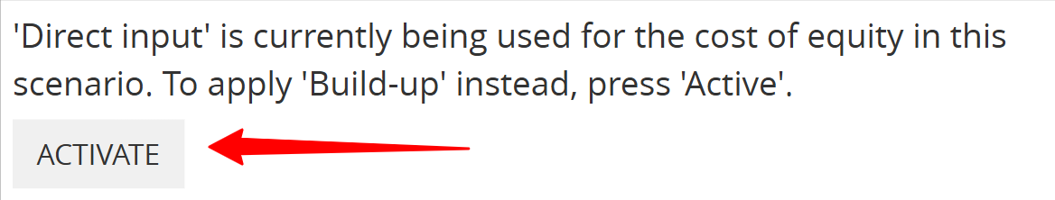
After choosing your COE method:
click here to see a guide for each method
-
Click "Activate" in the top-right corner of the tab
-
Then click "Return" to confirm and load the updated DCF view
This confirms your cost of equity is locked in for valuation.
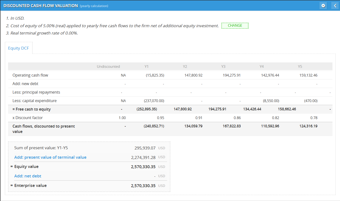
Step 3: View Discounted Cash Flow (DCF)
Once COE is set and confirmed, you’ll see the Discounted Cash Flow valuation.
The DCF table includes:
| Line | Description |
|---|---|
| Operating Cash Flow | Earnings before financing or investment |
| + New Debt | Loans added (if any) |
| – Principal Repayment | Loan paydowns |
| – Capital Expenditure | Equipment or infrastructure spend |
| = Free Cash to Equity | What’s left for equity holders |
| × Discount Factor | Based on your COE |
| = Discounted Cash Flows | Cash flows brought back to today’s value |
⚠️ Error message? Here's what it means:
If you see this note:
“Equity value for this scenario is not accessible... Cost of equity must be higher than the terminal growth rate.”
That means your COE is too low, or your terminal growth rate is too high.
📌 Fix it by:
-
Increasing the COE (e.g. from 0% to 8%)
-
Decreasing the terminal growth rate (e.g. from 3% to 1%)
Only when COE > terminal growth rate can the model compute a valid valuation.
Summary
| Step | Action |
|---|---|
| ✅ Scenario cash ≥ 0 | Unlocks valuation report |
| ✅ Set COE (Direct, Build-Up, or CAPM) | Required to calculate value |
| ✅ Click Activate + Return | Confirms COE method |
| ✅ View DCF | Shows present value of future equity cash flows |
Let me know if you want to break this into mini articles (e.g. “How to use CAPM” or “Fixing an invalid equity value”), or turn this into a quick checklist for new users.
🧠 Understanding the 3 Cost of Equity Methods
Method 1: Direct Input (Simple Manual Entry)
What it is:
You type in a fixed number that represents the required annual return on equity.
When to use it:
-
You already know your COE from previous work, investor targets, or analyst models
-
You don’t need to break down how the number was calculated
How to use:
-
Enter the % directly (e.g., 8.5%)
-
Done—this value is now used to discount future free cash flow
Pros:
-
Fastest and simplest
-
Ideal when working from a known figure
Cons:
-
No explanation of where the number came from
-
Less transparent if shared externally
Best for:
-
Quick comparisons
-
Scenarios with fixed investor hurdle rates
Method 2: Build-Up Method (Layered Risk Estimation)
What it is:
You build the COE step-by-step by adding individual risk premiums together.
When to use it:
-
You're valuing private companies or early-stage businesses
-
You want to justify each risk element separately
Typical Layers:
-
Risk-Free Rate – e.g. yield on 10-year government bonds
-
Equity Risk Premium – average excess return expected by stockholders
-
Size Premium – added for small or private companies
-
Company-Specific Risk – management risk, concentration risk, etc.
How to use:
-
Click ACTIVATE under the Build-Up tab
-
Use the + Add Build-Up Layer button
-
For each layer:
-
Enter a name (e.g. "Risk-Free Rate")
-
Input the % (e.g. 3.0%)
-
Add a short note (e.g. "10Y US Treasury as of Mar 2025")
-
-
The system will total all layers into a final COE
💬 Tip: Add a comment to summarize your full logic or link external benchmarks
Pros:
-
Transparent and explainable
-
Great for audit trails or investor discussions
Cons:
-
Slightly more effort
-
Requires some finance background
Best for:
-
Custom valuations
-
When justifying your risk assumptions is critical
Method 3: CAPM (Capital Asset Pricing Model)
What it is:
A market-based model that calculates COE using public market data.
Formula:
📘 COE = Risk-Free Rate + Beta × (Market Return – Risk-Free Rate)
When to use it:
-
You're valuing a business that has a comparable public peer
-
You want to use a structured finance approach based on investor expectations
Required Inputs:
-
Risk-Free Rate: Return on a “safe” asset like government bonds
-
Beta: Volatility relative to the market (can use industry beta if private)
-
Market Return: Expected average return from equities
Example:
-
Risk-Free = 3.0%
-
Beta = 1.2
-
Market Return = 10.0%
→ 3.0 + 1.2 × (10.0 – 3.0) = 11.4%
How to use:
-
Click the CAPM tab
-
Click ACTIVATE
-
Enter each value as prompted
-
Click RETURN to apply
💬 Tip: Use comments to cite where you got your Beta or market assumptions (e.g. Damodaran data, Bloomberg)
Pros:
-
Widely accepted in finance and investment
-
Based on actual market expectations
-
More robust for public-company contexts
Cons:
-
Assumes you have reliable Beta and market data
-
Doesn’t account for private company premiums unless manually added
Best for:
-
Pitch decks or reports for investors
-
Modeling with public peer benchmarks
✍ Summary Table: Choosing the Right Method
| Method | Best for | Quick Setup | Transparent | Customizable |
|---|---|---|---|---|
| Direct Input | Known investor returns / fast work | ✅ Fast | ❌ No source | ❌ Fixed only |
| Build-Up | Private company risk modeling | ⚠️ Manual | ✅ Yes | ✅ Fully editable |
| CAPM | Public-market logic / comparables | ⚠️ Moderate | ✅ Yes | 🔄 Limited to formula |
DCF Report: How Each Method Result in Discounted Cash Flow
No matter which Cost of Equity (COE) method you use, the DCF report structure stays the same—but how values are calculated and discounted depends entirely on the method you selected.
Here’s how each method drives the DCF calculation:
🅰️ Direct Input
You manually enter a single % as your Cost of Equity.
The DCF report uses this value to calculate the discount factor for each year.
-
Simple and fast
-
Assumes you already have a target return (e.g. investor-required 10%)
-
All cash flows are discounted using that single COE
Example:
You input 10% → Year 1 discount factor is 0.91, Year 2 is 0.83, etc.
Build-Up Method
You construct the COE by stacking multiple layers (e.g., risk-free rate, company risk).
The sum of these layers becomes your final COE, which drives the DCF discount factors.
-
Useful for private companies
-
Makes each risk component visible
-
The DCF logic is identical to Direct Input, but the COE is calculated, not typed
Example:
Risk-free 3% + size 2% + company risk 4% = 9% COE
DCF now uses 9% to discount future equity cash flows
CAPM (Capital Asset Pricing Model)
You enter:
-
Risk-free rate
-
Beta
-
Market return
The system calculates COE using:
📘 COE = Rf + β × (Market Return – Rf)
That final COE is then used to discount all projected Free Cash to Equity.
-
Market-based logic
-
Best when you want consistency with public market expectations
-
Works identically to the other methods once COE is generated
Example:
3% + 1.2 × (10% – 3%) = 11.4% COE → applied across 5-year cash flow stream
⚠️ Terminal Value logic (when applicable)
If the model includes a terminal value, that value is also discounted using your COE.
⚠️ You’ll receive a warning if COE ≤ Terminal Growth Rate, because the formula breaks.
Fix this by:
-
Raising your COE
-
Reducing your terminal growth assumption
⚙️ Additional Settings & Adjustments For Valuation Report
Once your valuation is running, you can fine-tune it from the settings panel in the top right of the report.
🔧 1. Open Report Settings
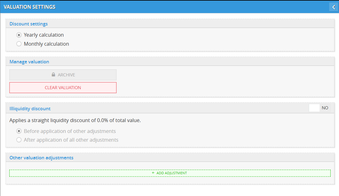
Click the gear icon in the top-right corner of the Valuation Report screen.
Inside, you can:
🗓 Set calculation method
-
Choose between Yearly and Monthly discounting
-
Yearly is simpler and faster; Monthly gives more precision
💧 Illiquidity discount
Apply a straight discount to account for lack of liquidity (e.g., private company valuation):
-
Turn ON or OFF
-
Choose to apply the discount before or after other adjustments
-
Set the % discount manually
Use this if you're modeling a minority interest, restricted shares, or a non-tradable business.
➕ Add other valuation adjustments
Click “+ Add Adjustment” to input any custom valuation modifiers.
You can use this for things like:
-
Control premium
-
Strategic acquisition premium
-
Marketability discount
-
Adjustments for known liabilities
Each entry includes:
-
A name for the adjustment
-
A % impact
-
An optional explanation
🔁 2. Change cost of equity method (if needed)
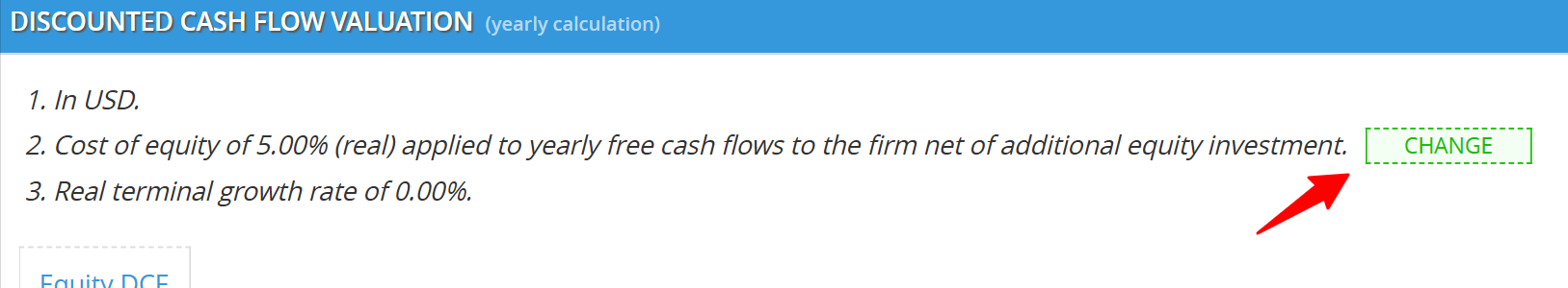
At the top of the Valuation Report, you’ll see a summary row showing your current assumptions (e.g., COE and terminal growth rate).
To switch methods:
-
Click “CHANGE” next to the cost of equity
-
Select the new method (Direct Input, Build-Up, or CAPM)
-
Click Activate
-
Click Return to apply changes
Your DCF will automatically recalculate using the new settings.
Cash Balance Report
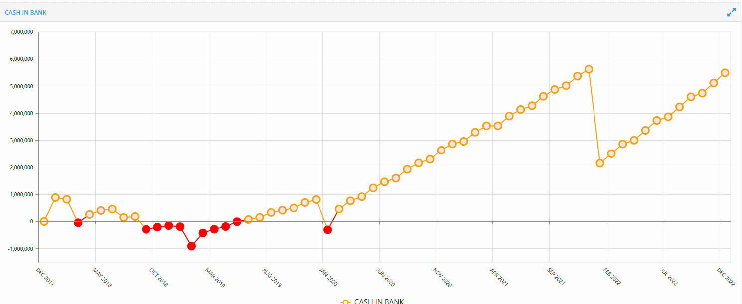
The Cash Balance Report shows how your available cash changes month by month, based on all operating, financing, and investment activity in the scenario.
It’s the fastest way to check if your business stays solvent—or when it might run out of cash.
🔴 Red tab = Insolvent Scenario
If the Cash Balance tab turns red, it means your cash balance drops below zero at least once during the forecast period.
This scenario is considered insolvent and won’t be eligible for Valuation reporting (like DCF or Equity Value).
You’ll need to fix it by:
-
Adding financing
-
Adjusting timing of expenses
-
Reducing early costs or capex
📈 How to read the graph
-
Each dot = one monthly cash point
-
Yellow = positive cash
-
Red = negative cash (insolvency)
You can:
-
Hover over any point to see the exact value
-
Scroll to zoom in or out
-
Drag left/right to move across time
Example:
If you see a section of the line turn red in mid-2019, it means the business runs out of cash during that period, even if it later recovers.
That’s still considered risky—and will block valuation unless addressed.
✅ What to aim for
✔ Ideally, your cash line should stay above zero for all months.
✔ A smooth upward trend = strong cash position
✔ Short dips may be okay, but they must be resolved by adding financing or reducing outflows.
📌 Tips
-
You can use this chart to backtrack exactly when funding is needed
-
If you’re building a scenario for investors, this is the first place to check if your timeline is realistic
-
Scroll to zoom in on short-term crunch periods, like the first 6–12 months
Unit Sales Report
The Unit Sales Report shows how many units you actually sold each month, and whether sales were limited by customer demand or by available inventory.
This report helps you quickly see whether:
-
You met customer demand
-
You missed out on sales
-
You overproduced and had leftover stock
📘 How unit sales are calculated
Every month, the system compares two things:
-
Demand — how much customers wanted to buy
-
Availability — how much stock you had ready to sell
Then it does this:
Sales = the lower of demand or availability
If demand is high but you don’t have enough stock, sales will be lower.
If you have more stock than demand, sales are still limited to what customers want.
📊 How to read the chart
Each month shows 3 main indicators:
🔷 Blue bars = Units Produced in Period
This shows how many units were produced that month.
It’s your supply-side activity.
🟢 Green dots = Demand in Period
This shows how many units customers wanted that month.
This is your forecasted or actual customer need.
🟡 Yellow dots = Sales in Period
This is how many units were actually sold.
It is always equal to the lesser of demand or availability.
📌 This is the most important number—it tells you what actually left your warehouse.
🖱 Hover to see details
When you hover over a yellow dot, you’ll see a tooltip like this:
🧾 Example Tooltip:
Sales: Beef and cilantro: 1 KG retail pack
APR 2020
Lesser of:
Period demand: 13,431 x pcs
or
Period availability: 13,431 x pcs
= Total sales: 13,431 x pcs
Here’s what each line means:
-
Product + Date: The item and month you're looking at
-
Period demand: How many units customers wanted
-
Period availability: How many units were available to sell
-
Total sales: The smaller number between demand and availability (what actually sold)
🔍 What to look for
🔻 If the yellow dot is lower than the green dot
➡ You didn’t meet demand (not enough stock)
✅ Action: Increase production or starting inventory
🔻 If the yellow dot is lower than the blue bar
➡ You made more than you sold (demand was low)
✅ Action: Adjust demand forecast or reduce output
🧠 Why this matters
This report helps you:
-
Spot stockouts (when you lose sales due to lack of product)
-
See where you’re holding excess stock
-
Align your production better with customer needs
-
Prevent overproduction or missed revenue
🔧 Interaction tips
-
Hover to see exact numbers
-
Scroll to zoom in or out across time
-
Click the dropdown in the top-right to change products
-
Use this together with the Operational Report to understand where sales constraints are coming from
✅ Use cases
-
Are we selling as much as customers want?
-
Do we need to boost production to catch up with demand?
-
Are we producing too much and wasting inventory?
-
When are we likely to run into missed sales?
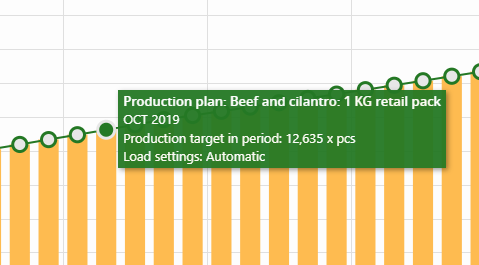
Unit Produced Report
The Unit Produced Report shows how many units you actually produced each month compared to your production plan.
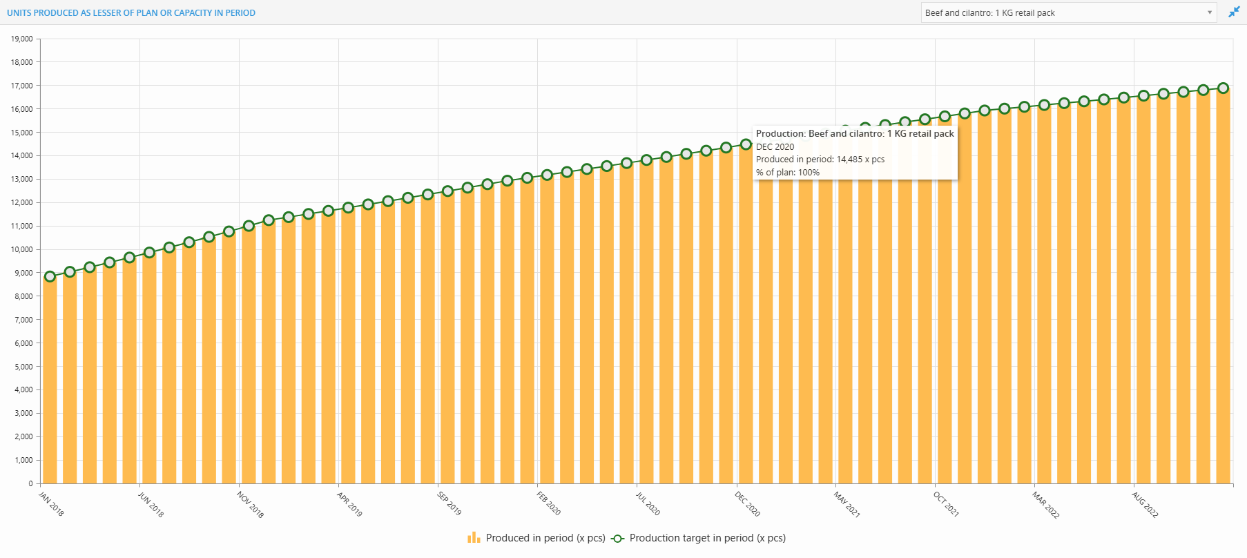
It helps answer:
“Did I hit my production target this month, or fall short because of a constraint?”
✅ First, check the product
Before reading the chart, make sure you’re looking at the right product.
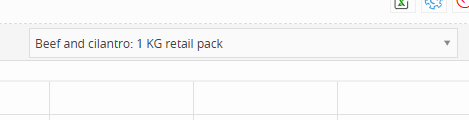
Look at the top right of the screen — you'll see a dropdown showing the product name (e.g. Beef and cilantro: 1 KG retail pack).If you want to change it, click the dropdown and select another product.
📊 What you’re seeing on the chart
Each month includes two data points:
🟧 1. Orange Bars = Units Produced
This is how many units were actually produced in that month.
It reflects the real output, including any constraints (capacity, resources, etc.).
🟢 2. Green Circles = Production Target (Planned)
This is how many units you intended to produce that month.
It’s your planned production volume from your scenario setup.
Hover to see the tooltip
When you hover over an orange bar, you’ll see a breakdown:
Tooltip Example:
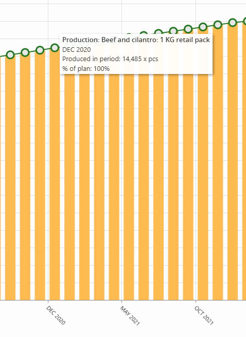
Production: Beef and cilantro: 1 KG retail pack
DEC 2020
Produced in period: 14,485 x pcs
% of plan: 100%🔍 What each line means:
Product + Date: Confirms what product and which month you’re viewing
Produced in period: Actual number of units made that month
% of plan: How much of your target was achieved
100% = you hit the target
Less than 100% = some constraint held you back
Over 100% = rare, but can happen if planning logic allows overproduction
🔻 What to watch for
If the orange bar is shorter than the green dot → You missed your production target
If the orange bar and green dot match → You hit the plan perfectly
If you consistently fall short → You may need to adjust your production capacity or assumptions
📌 Interaction tips
Hover over bars to view actual numbers and plan %
Zoom in or out with your mouse scroll
Change products using the dropdown at the top right
✅ Use this report to:
-
Track whether production meets plan
-
Spot gaps due to equipment, staffing, or raw material limits
-
Improve planning accuracy by comparing actual vs. target
-
Understand where you may need to adjust operations
Headcount Report
The Headcount Report shows how your workforce changes over time. Each column represents the total number of employees for a given month, grouped by either department or position.
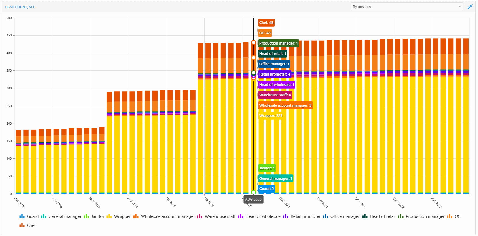
📊 Two ways to view
Use the dropdown at the top right to switch between:
-
By Department → Groups headcount by functional area (e.g. Kitchen, Warehouse, Retail)
-
By Position → Groups by job role (e.g. Chef, Wrapper, QC, Manager)
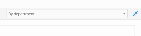
Hover for details
Hovering over any bar shows the number of employees in each group for that month.
This helps you:
Track team growth
Spot hiring waves
Understand org structure by time
Equipment Roll-Out Report
This report shows how many units of each equipment type are in use over time.
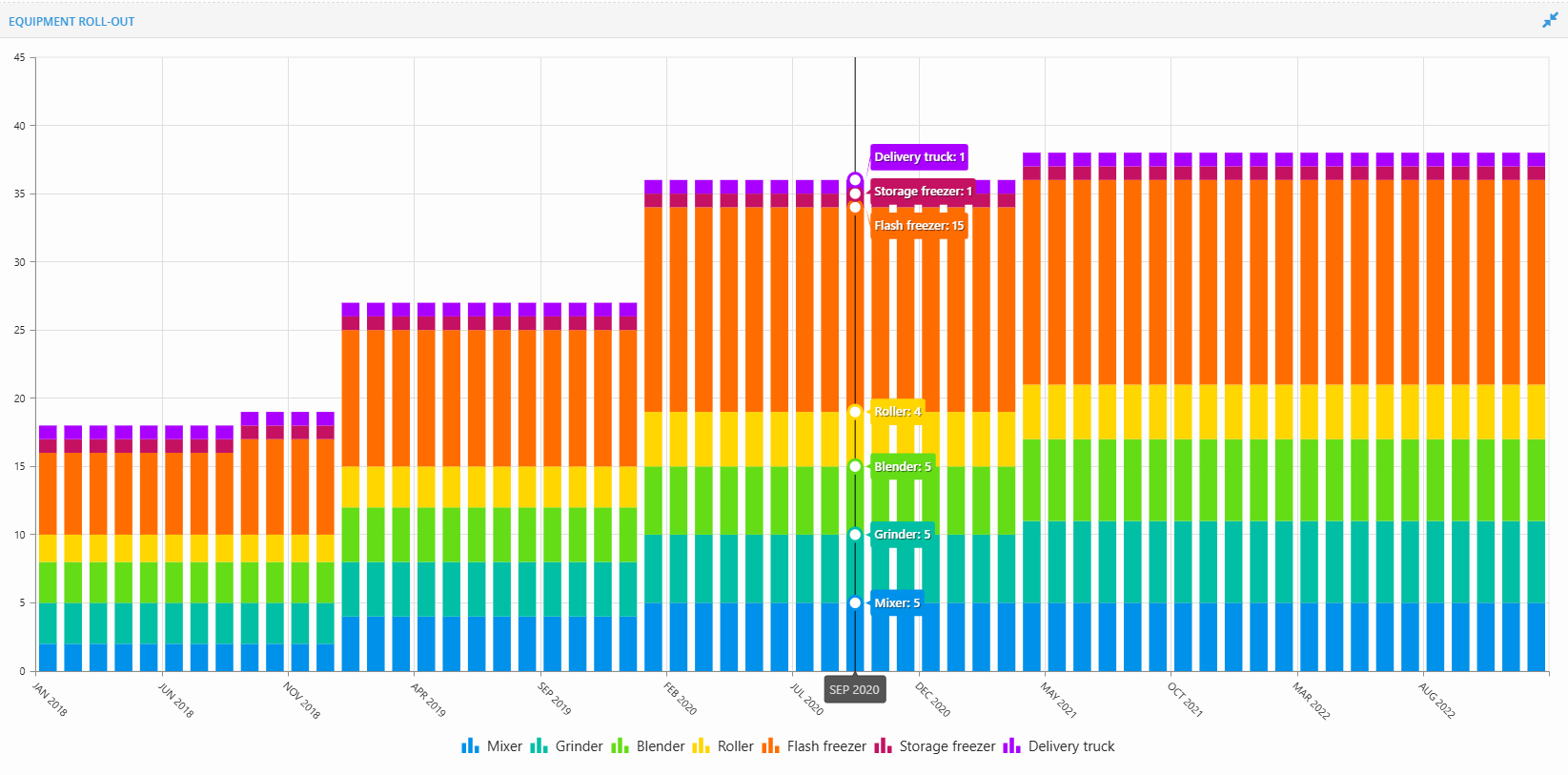
Each bar = total equipment deployed in a given month
Each color = a different equipment type (e.g. mixer, roller, freezer)
Hover to see details
Hover over any bar to view:
Exact number of each equipment type in that month
Use this report to:
-
Track when equipment is rolled out
-
Understand operational scaling
-
Align equipment with production or staffing plans
Footprint Report
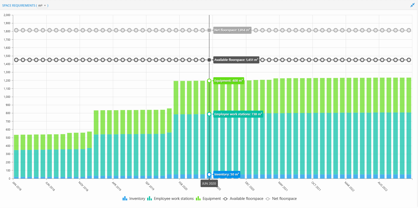
The Footprint Report shows how much physical space your operations require each month.
Each bar shows the total space used, broken down into:
-
Inventory (blue)
-
Employee work stations (teal)
-
Equipment (green)
You’ll also see two horizontal lines:
-
Available floorspace (black)
-
Net floorspace (gray)
How to interpret it
Your total bar height should stay below the black line (Available Floorspace).
If the bars go above the black line, it means your operations require more space than you have — this could lead to production issues, safety problems, or blocked growth.
In that case, you may need to:
Add more floorspace
Delay hiring or equipment rollout
Adjust layout assumptions
⚙️ Switch measurement type
If you’ve added multiple measurements (e.g. m², ft²) in Land & Buildings,
you can change the unit using the dropdown at the top-left of the report.
📌 Use this report to:
-
Ensure operations stay within spatial limits
-
Plan expansions based on actual space usage
-
Coordinate headcount and equipment with floor layout
💡 If this doesn’t solve your issue or you have more questions, feel free to reach out through our [contact form]. We’ll get back to you within 2–3 business days.