Requirements Before Performing Variance Analysis
Performing Variance Analysis in Decision Critical
Starting Points of Scenarios in Reports
Variance Analysis module in Decision Critical
Variance analysis is the main application for the Historical Performance module of Decision Critical. It helps you evaluate your financial performance by comparing actual outcomes (backward-looking data) against business plans, forecasts and other scenarios you create (forward looking projections). This analysis is crucial for identifying deviations from expected results, understanding the underlying causes of these variances, and making informed adjustments to business strategies.
Requirements Before Performing Variance Analysis
Before conducting a Variance Analysis in DC, you will need to have historical data uploaded to the system, as well as at least one forecast (Scenario) for the same company. The forecast will have been performed in the past and should overlap in one or more periods with your historical data.
-
Historical Performance data:
Before you can perform a Variance Analysis, it is important to have all relevant historical data entered in the Historical Performance module of Decision Critical. Ideally, the data should be verified and marked as 'Confirmed.' This step ensures that the data used for comparison is accurate and reflects the actual performance of the business.
For example: If you are analyzing the variance for the three years from January 2018 to January 2021, try to have all data for this period marked as 'Verified' and the period itself designated as 'Confirmed'.
Note: You can still compare results for periods that have not been marked 'Confirmed', but data confirmation is an additional step to ensure that you or someone from your organization has checked the numbers.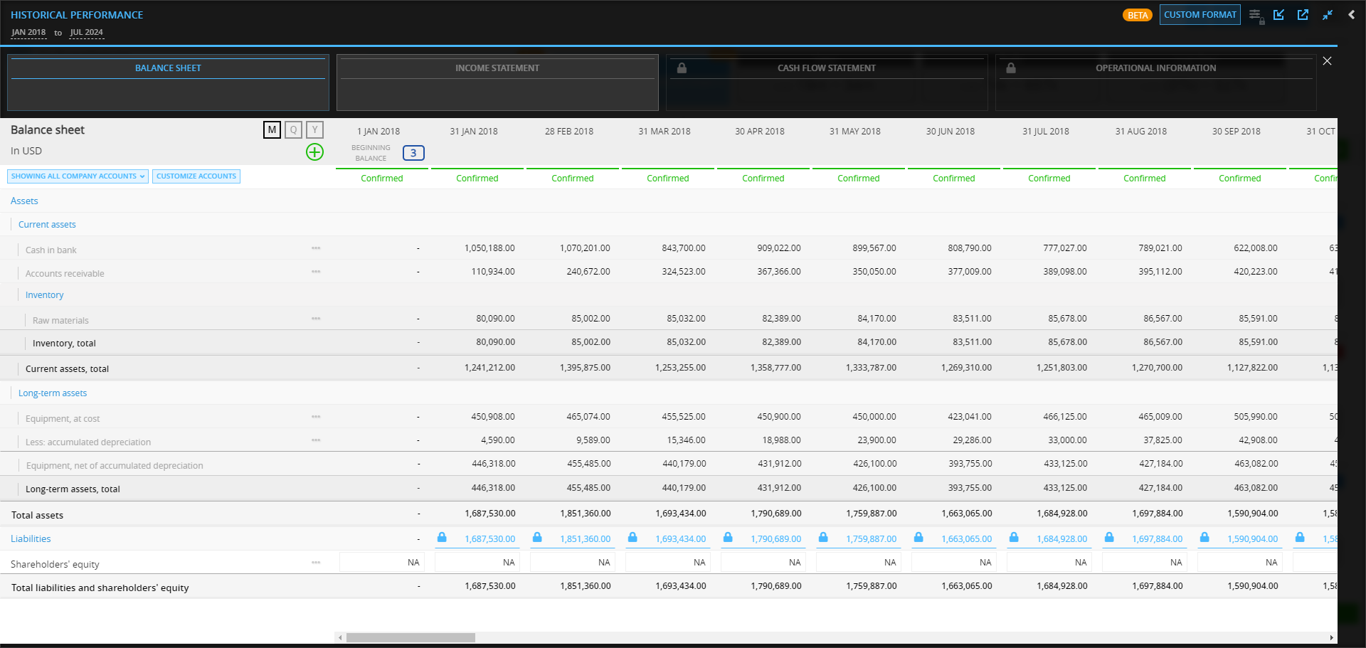
If you don't have all the relevant historical data in the Historical Performance interface, consider reviewing the following articles:
(1) Get started with Historical Performance
(2) Data importing for Variance Analysis
(3) Account mapping in Historical Performance
(4) Data validation in Historical Performance -
Scenario preparation:
Ensure the scenarios you want to compare against your actual performance are created in Decision Critical under the same company. These scenarios could be different strategic plans or different sets of market conditions you want to evaluate. Having these scenarios ready will allow for a smooth comparison process.
Performing Variance Analysis in Decision Critical
After importing, copying or entering valid historical data into Decision Critical, you are ready to perform Variance Analysis.
This process allows you to compare actual performance against predefined scenarios to understand deviations and adjust strategies accordingly.
Here’s how to get started:
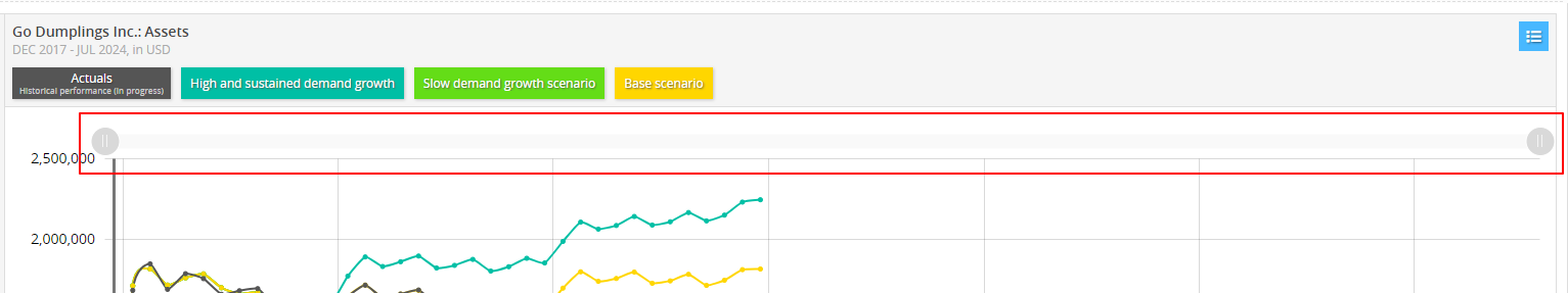
- Check the Accounts and Period: Make sure the accounts in the Historical Performance module (like Balance Sheet or Income Statement) overlap with one or more of the periods you want to analyze against your scenarios.
- Confirm Data Validation Status: Ideally, the data for the account(s) and period(s) you’re analyzing should have a status of 'Confirmed' or at least 'Tentative'. (read about the status here)

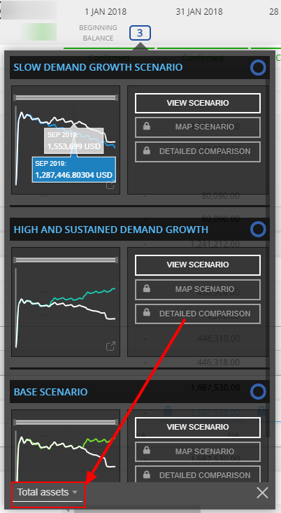
- Look for Scenario Indicators: In periods in which your company has a scenario starting, there should be a scenario indicator in the period date header. The indicators look different depending on whether the balance sheet for that day matches the beginning balance of the scenario in Decision Critical.
Read full details on each indicator in Starting Points of Scenarios in Reports.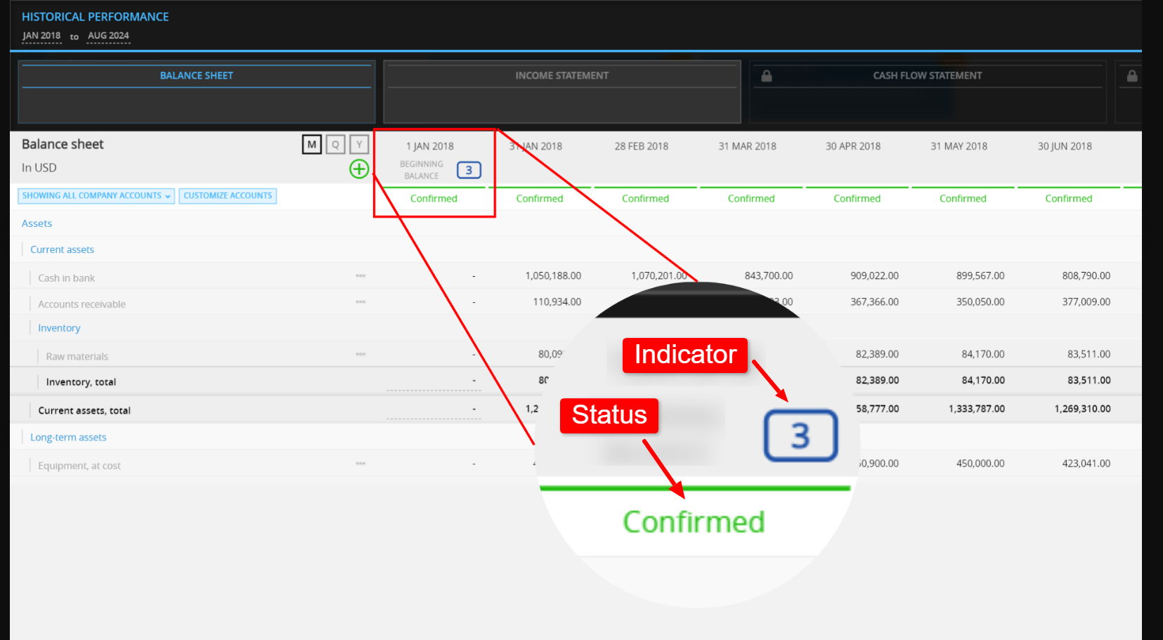
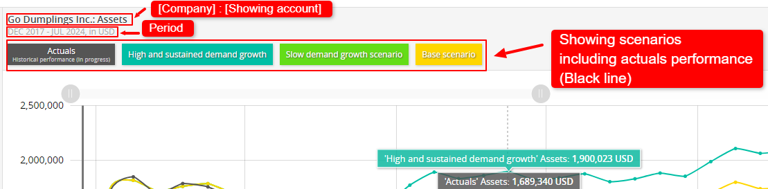
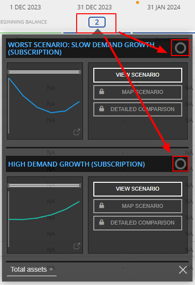
- View the Scenario Comparison: Click on the scenario indicator to open the comparison drop-down. This window displays a graph that compares your actual data against the scenario data (you can toggle between different accounts using the account picker on the bottom left). Each graph in the drop-down shows a different scenario and how that scenario compares to the historical financial statements.
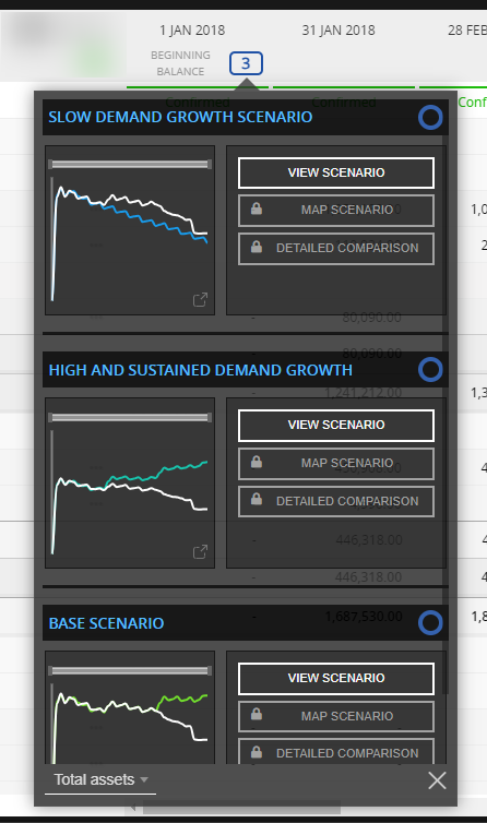
You can hover over the graph to see detailed data for each period.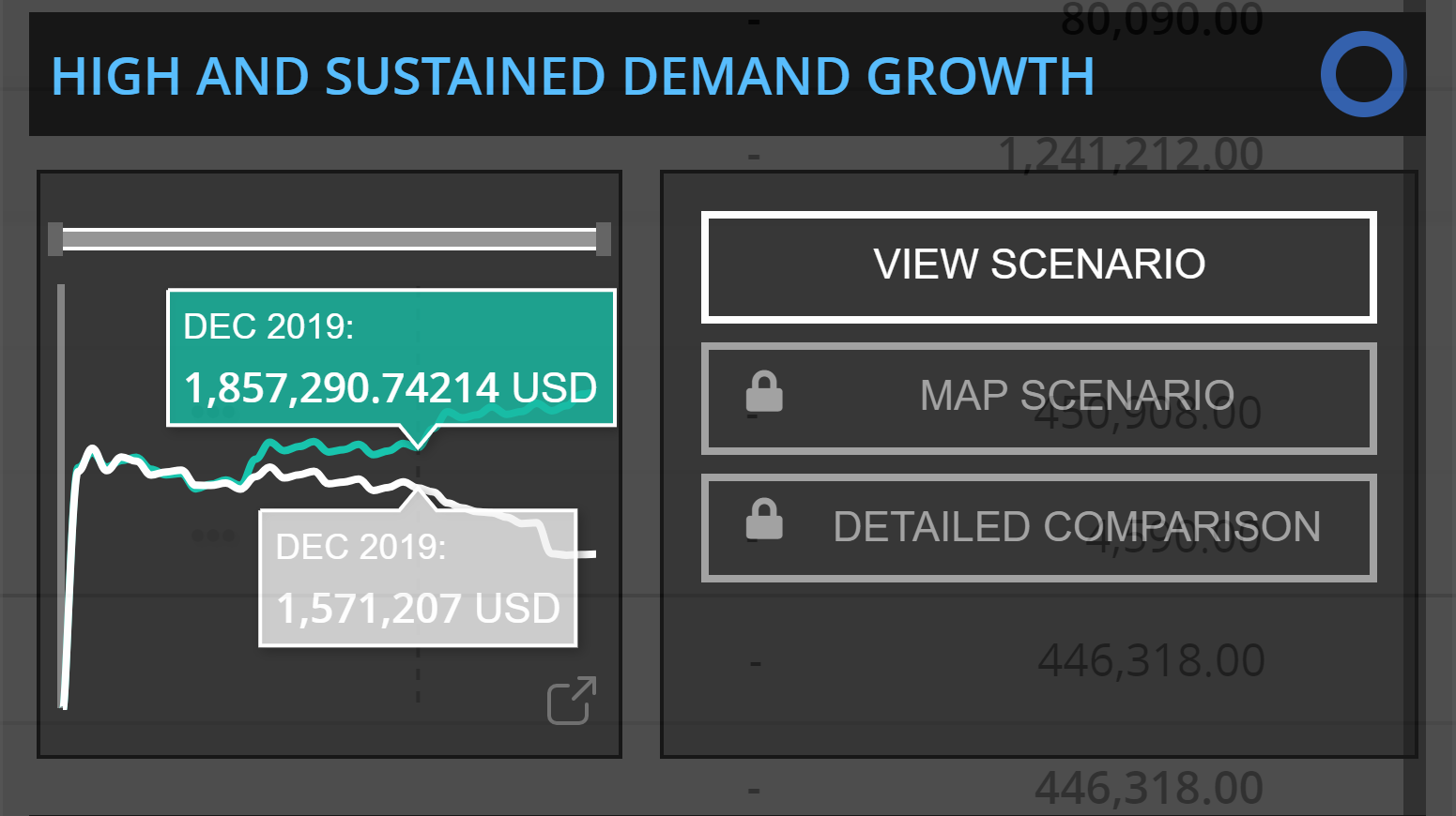
If you want to focus on a particular scenario, click "View Scenario", it will open that scenario in new window.
- Select account for analysis: In the comparison window, use the dropdown menu at the bottom left to pick the specific account you want to analyze. This lets you view different accounts during the selected period.
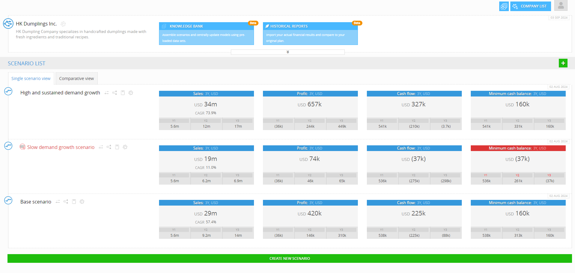
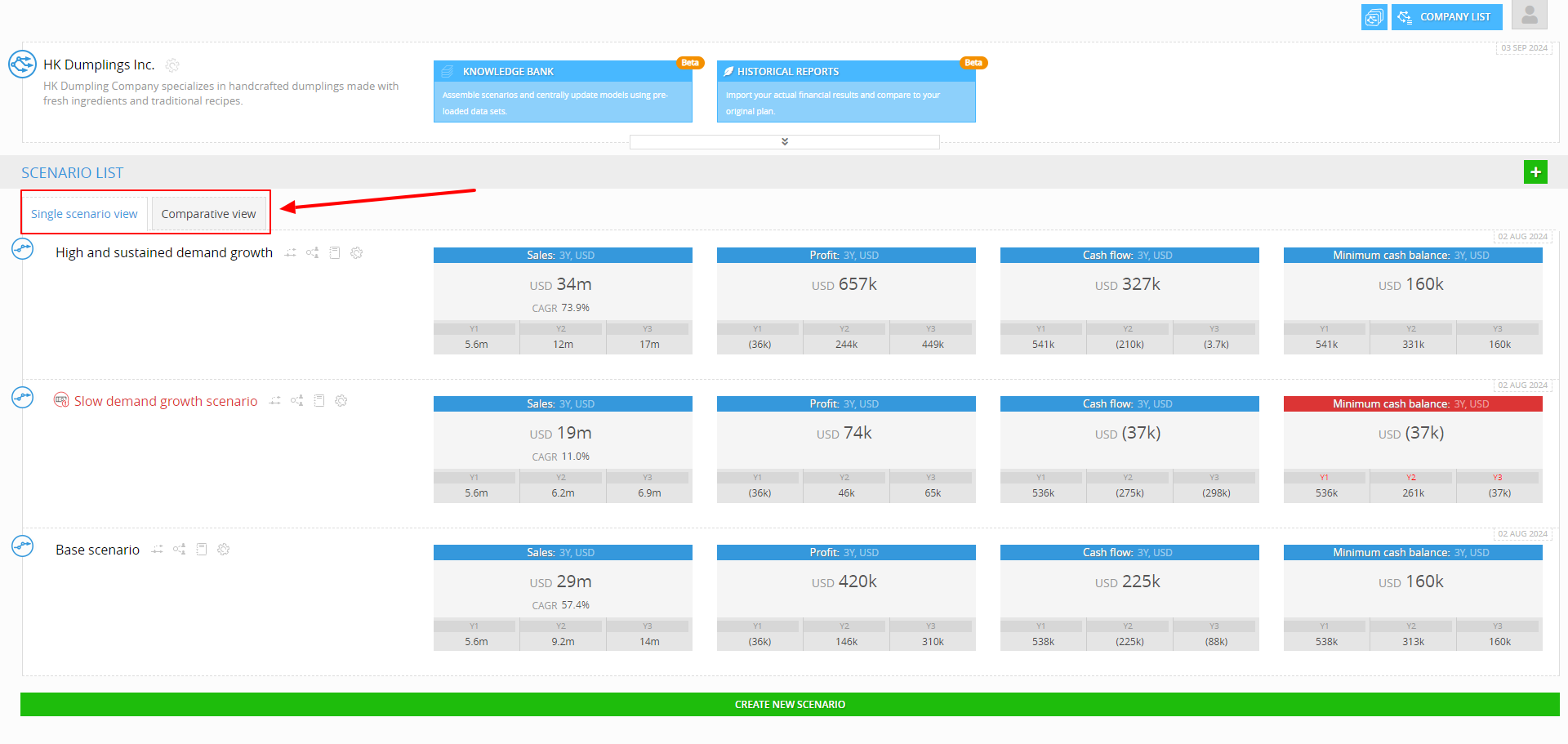
Conducting Variance Analysis with Multiple Scenarios
If you want to perform a Variance Analysis by comparing multiple scenarios, you can see the variance analysis through the Comparative View tab in the Analytics Interface. Here’s how:
- Navigate to the Scenario Page: If you're currently on the Historical Performance page, clicking the "Close" button in the top right corner of the screen will redirect you to the Scenario page (/analytics).
- Access Comparative View: On the Scenario page, find the "Scenario View" tab. You'll see options for "Single Scenario View" and "Comparative View." Click on "Comparative View" to proceed.
- Select the Report and Accounts: In Comparative View, you'll notice a panel on the left side where you can select different types of reports, such as Balance Sheet, Income Statement or Cash flow. Choose the report you want to analyze and then select specific accounts from the list that appears below. This will update the visualization pane with the selected accounts.
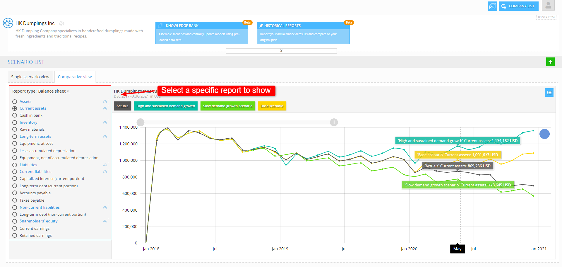
- Visualize Scenarios on the Graph: The visualization pane will display a graph similar to the one seen in the Historical Performance module, but here it allows for a side-by-side comparison of multiple scenarios. Each scenario is represented by a different color on the graph, making it easy to visually compare the actual performance against various projected scenarios.
- Customize Scenario Selection: To focus on specific scenarios, locate the menu icon on the top left of the visualization pane (depicted as a list icon). Click this to open a menu where you can check or uncheck scenarios you want to include or exclude from the comparison.
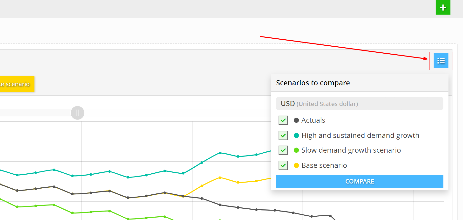
Once you've made your selection, click the "Compare" button to update the graph with your chosen scenarios.
Starting Points of Scenarios in Reports (Scenario Indicators)
In financial reports, scenarios are specific financial models or projections based on different sets of assumptions about the future. Each scenario is a distinct 'What-if' analysis. Scenarios have set start dates referred to as the 'Beginning Balance'. If the starting date of a scenario matches the first period of the historical report, it is reflected in the beginning balance column. However, if the historical report begins earlier, the balance from the last available date before the scenario’s start is used.
For instance, if both the scenario and the historical report start on January 1, 2024, the balance is recorded on that date. If the historical report begins earlier, such as December 31, 2023, the earlier balance is used instead.
Note: In our case, this is a semantical difference. In practice, the ending balance on 31 December is the same as the beginning balance on 1 January of the following year.
The system uses various symbols like circles and squares(box) to indicate the status of scenario matching .
Here’s a breakdown of what each symbol represents:
-
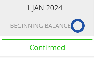
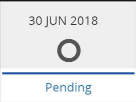
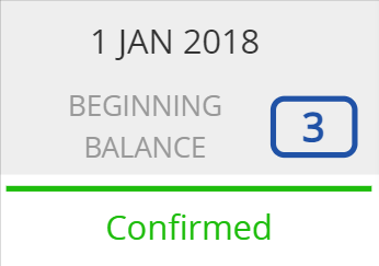
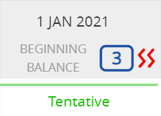
Circle Symbol: Individual Scenario Marker
The circle symbol by itself means that there is a scenario that there is a scenario (e.g., business plan or forecast) which starts on that date. If there is no 'Break Symbol' (see below), that means that scenario beginning balance data match the historical balance sheet data for that date.
Color is used to signify the verification status of the corresponding historical data.
- Filled blue circle: For a historical period that has not been confirmed yet.
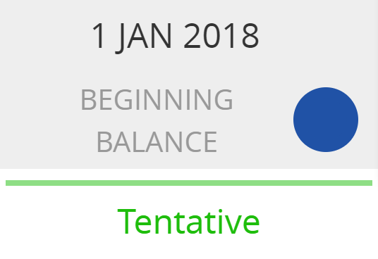
- Unfilled blue circle: For a historical period with the status 'Confirmed'.
- Unfilled grey circle: For a historical period with a status of 'Incomplete' or 'Pending'.
- Filled blue circle: For a historical period that has not been confirmed yet.
- Break Symbol: The red 'Break' symbol is used to indicate that the beginning balance of the scenario does not exactly match the historical balance sheet for the same date in the Historical Performance interface. This may indicate a discrepancy that needs to be fixed, or it may simply be a reminder that the beginning balance of the scenario is not that same as the actual balance sheet for the company on that day.
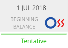
For example:
The scenario's beginning balance is set for January 31, 2022, and the historical period is also set with a beginning balance on January 31, 2022 (so the dates match).
However, the 'cash in bank' account values that were mapped don’t match the historical data, showing a difference that, for an active scenario, should be fixed to line up with the actual data.
- Box (with number): Multiple Scenario Marker
Numbered boxes simply mean that the company has more than one scenario which starts on the given date. The number inside the box shows how many scenarios start in that period. Standards for color of the marker, whether it is filled or unfilled and whether or not it has a "Break Symbol" are according to the same criteria that are used for an Individual Scenario Marker.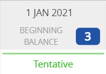
To see the specific status of each scenario, click on the box to expand it.
Need help? 💡
If you need additional help, reach out to us at:
support@decisioncritical.pro